Introduction
|
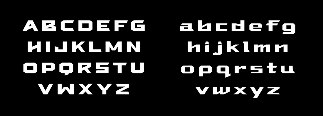
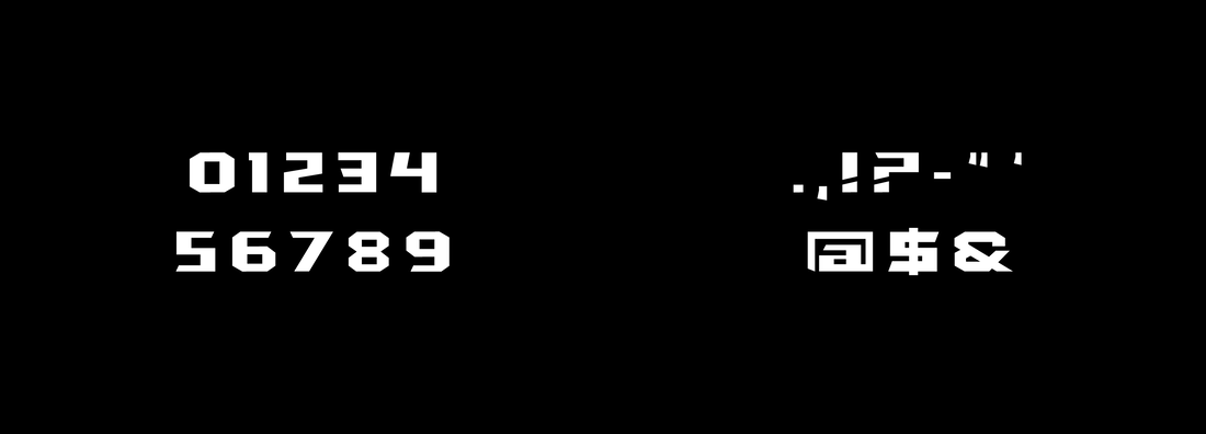
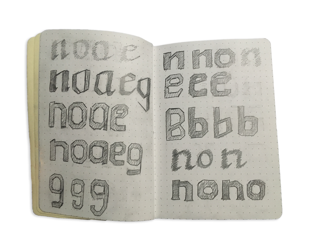
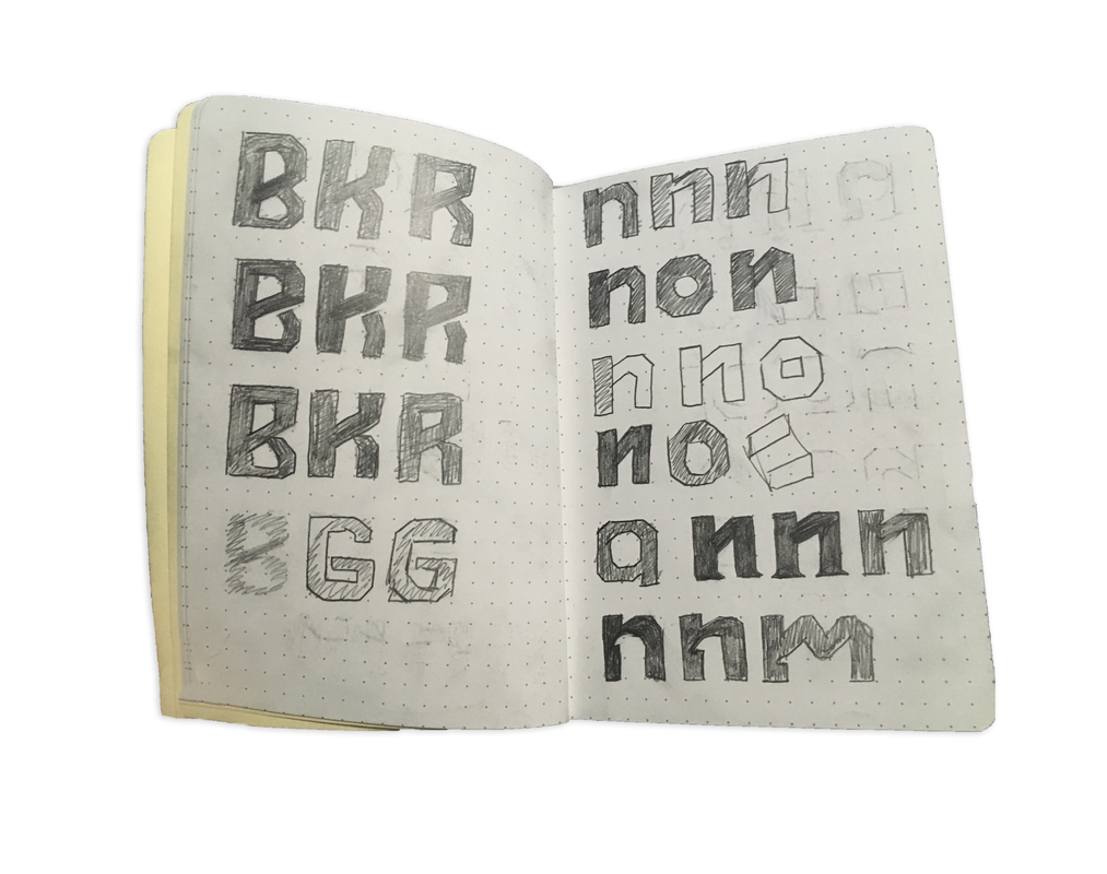
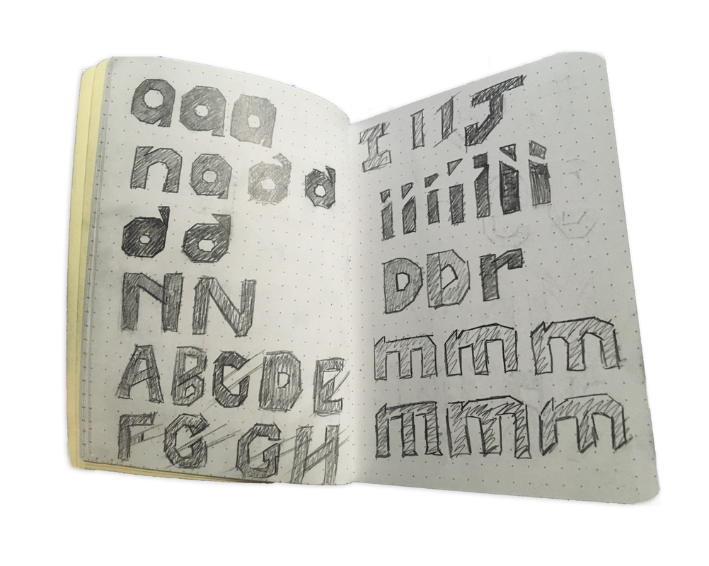
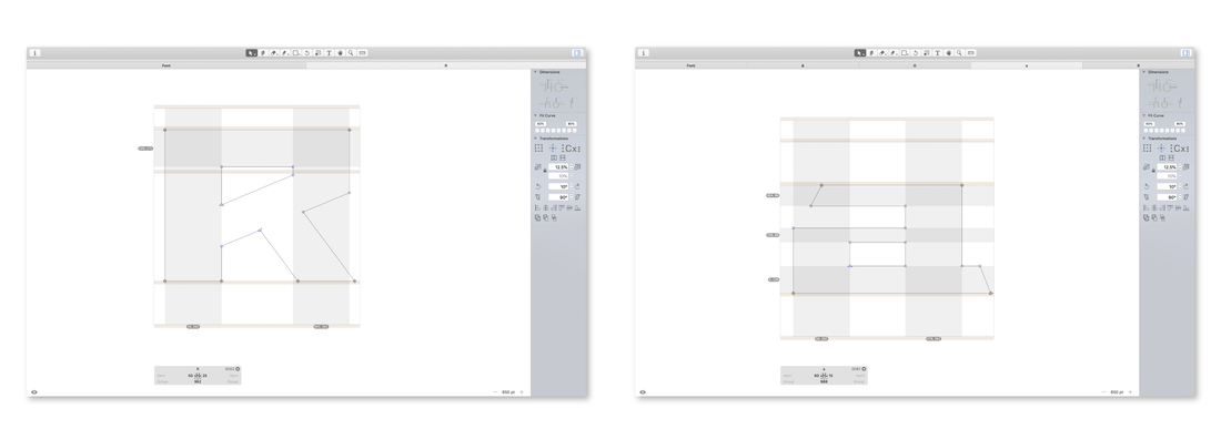
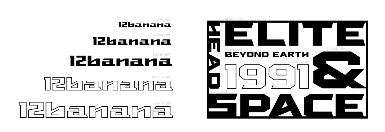
Bloksir is an audacious and deliberate typeface which speaks with authority, confidence, and certainty. It is an extremely bold and extended font consisting of straight and sharp edges with thick strokes. The uppercase letters have low stroke contrast and lowercase letters have a moderate stroke contrast. Due to the extreme letterform widths, Bloksir gives the illusion of a shortened cap-height and a low-to-moderate x-height.
Tools Used | Glyphs, Adobe Indesign, Adobe Illustrator, Adobe Photoshop Designed in 2018 |
Specimen
Intended Use
|
This loud and to-the-point “blocky” typeface was designed for introducing a brand or idea, with the intent of being printed at large font sizes. Bloksir is great for printing materials such as billboards, posters, bulkhead signage, banners, logotypes, wordmarks, editorial headlines, short pull-quotes, apparel, urban streetscapes, as well as other environments which call for type printed at large sizes.
|
Inspiration
- Formula 1
- F1 Torque
- Opening credits of the classic film King Kong, (1933)
- F1 Torque
- Opening credits of the classic film King Kong, (1933)
|
|
|
|
|
|
|

|
|
|

